Two Big Problems with Data
- We want to use econometrics to identify causal relationships and make inferences about them
Problem for identification: endogeneity
Problem for inference: randomness

Identification Problem: Endogeneity
An independent variable (X) is exogenous if its variation is unrelated to other factors that affect the dependent variable (Y)
An independent variable (X) is endogenous if its variation is related to other factors that affect the dependent variable (Y)

Identification Problem: Endogeneity
- An independent variable (X) is exogenous if its variation is unrelated to other factors that affect the dependent variable (Y)
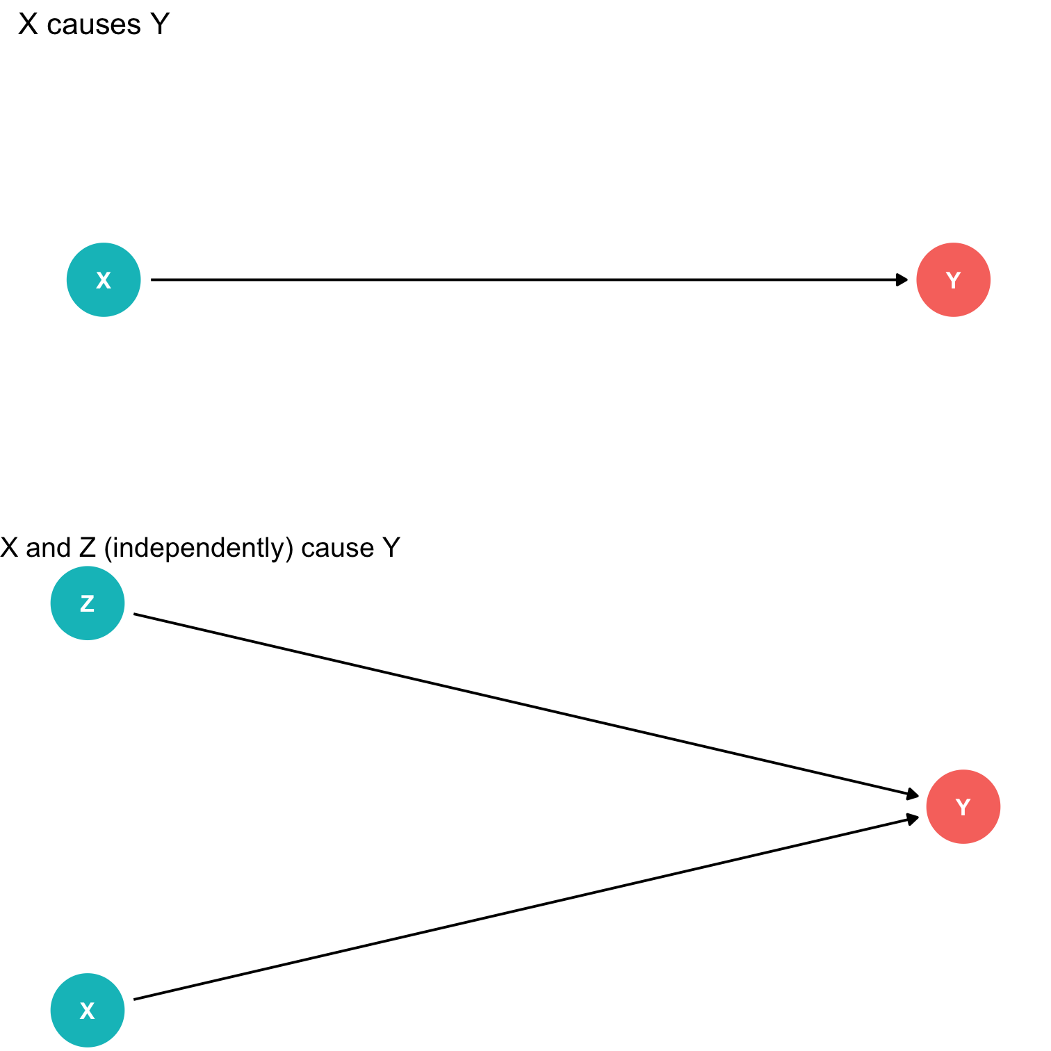
Identification Problem: Endogeneity
- An independent variable (X) is endogenous if its variation is related to other factors that affect the dependent variable (Y)

Inference Problem: Randomness
- Data is random due to natural sampling variation
- Taking one sample of a population will yield slightly different information than another sample of the same population
Common in statistics, easy to fix
Inferential Statistics: making claims about a wider population using sample data
- We use common tools and techniques to deal with randomness

Data 101
Data are information with context
Individuals are the entities described by a set of data
- e.g. persons, households, firms, countries

Data 101
Variables are particular characteristics about an individual
- e.g. age, income, profits, population, GDP, marital status, type of legal institutions
Observations or cases are the separate individuals described by a collection of variables
- e.g. for one individual, we have their age, sex, income, education, etc.
individuals and observations are not necessarily the same:
- e.g. we can have multiple observations on the same individual over time
Categorical Data
Categorical data place an individual into one of several possible categories
- e.g. sex, season, political party
- may be responses to survey questions
- can be quantitative (e.g. age, zip code)
In
R:characterorfactortype datafactor⟹ specific possible categories

Categorical Data: Visualizing II
Charts and graphs are always better ways to visualize data
A bar graph represents categories as bars, with lengths proportional to the count or relative frequency of each category
ggplot(diamonds, aes(x=cut, fill=cut))+ geom_bar()+ guides(fill=F)+ theme_pander(base_family = "Fira Sans Condensed", base_size=20)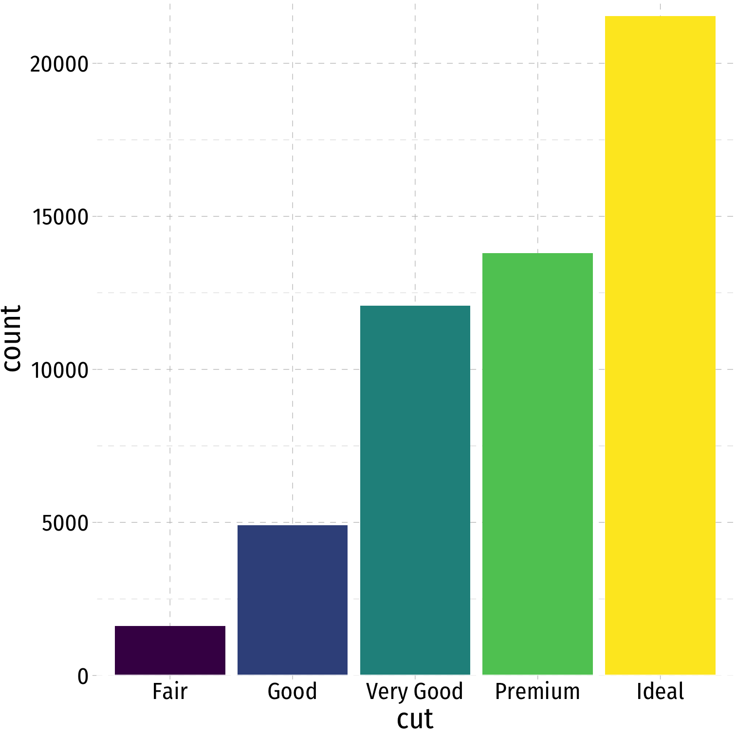
Categorical Data: Visualizing III
Avoid pie charts!
People are not good at judging 2-d differences (angles, area)
People are good at judging 1-d differences (length)

Categorical Data: Visualizing IV
- Maybe a stacked bar chart
diamonds %>% count(cut) %>%ggplot(data = .)+ aes(x = "", y = n)+ geom_col(aes(fill = cut))+ geom_label(aes(label = cut, color = cut), position = position_stack(vjust = 0.5) )+ guides(color = F, fill = F)+ theme_void()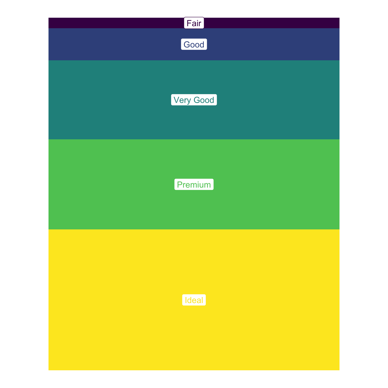
Categorical Data: Visualizing IV
- Maybe lollipop chart
diamonds %>% count(cut) %>% mutate(cut_name = as.factor(cut)) %>%ggplot(., aes(x = cut_name, y = n, color = cut))+ geom_point(stat="identity", fill="black", size=12) + geom_segment(aes(x = cut_name, y = 0, xend = cut_name, yend = n), size = 2)+ geom_text(aes(label = n),color="white", size=3) + coord_flip()+ labs(x = "Cut")+ theme_pander(base_family = "Fira Sans Condensed", base_size=20)+ guides(color = F)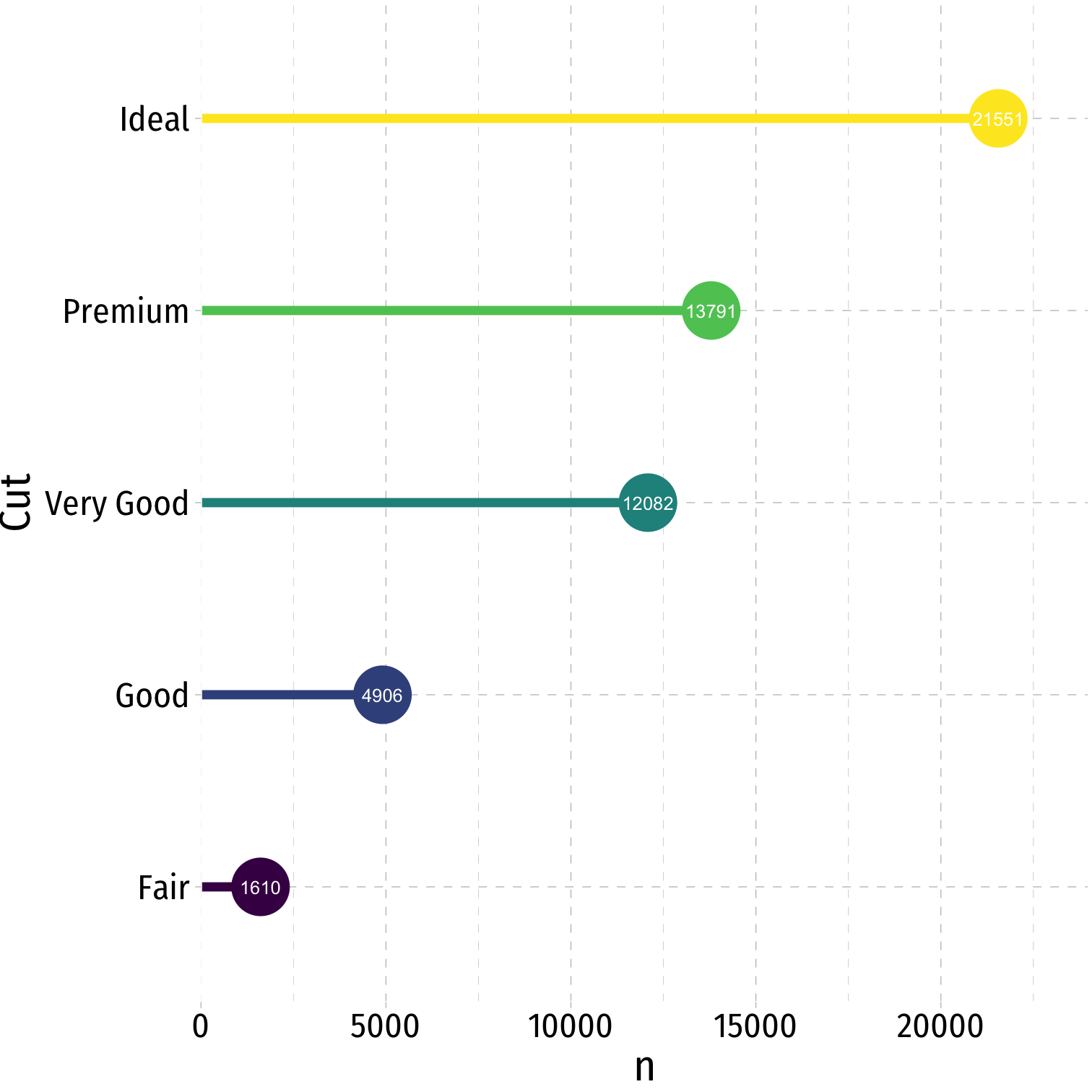
Categorical Data: Visualizing IV
- Maybe a treemap
library(treemapify)diamonds %>% count(cut) %>%ggplot(., aes(area = n, fill = cut)) + geom_treemap() + guides(fill = FALSE) + geom_treemap_text(aes(label = cut), colour = "white", place = "topleft", grow = TRUE)
Quantitative Data I
Quantitative variables take on numerical values of equal units that describe an individual
- Units: points, dollars, inches
- Context: GPA, prices, height
We can mathematically manipulate only quantitative data
- e.g. sum, average, standard deviation
In
R:numerictype dataintegerif whole numberdoubleif has decimals

Discrete Data
Discrete data are finite, with a countable number of alternatives
Categorical: place data into categories
- e.g. letter grades: A, B, C, D, F
- e.g. class level: freshman, sophomore, junior, senior
Quantitative: integers
- e.g. SAT Score, number of children, age (years)

Continuous Data
Continuous data are infinitely divisible, with an uncountable number of alternatives
- e.g. weight, length, temperature, GPA
Many discrete variables may be treated as if they are continuous
- e.g. SAT scores (whole points), wages (dollars and cents)

Two Branches of Statistics
- Two main branches of statistics:
Descriptive Statistics: describes or summarizes the properties of a sample
Inferential Statistics: infers properties about a larger population from the properties of a sample†

† We'll encounter inferential statistics mainly in the context of regression later.
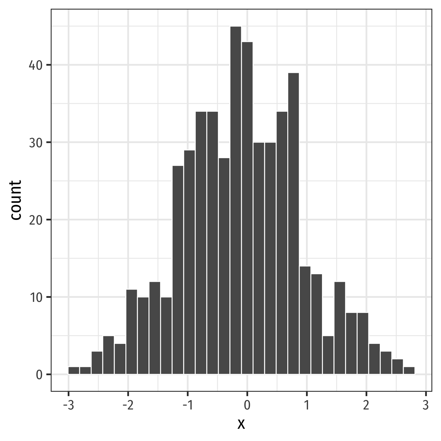
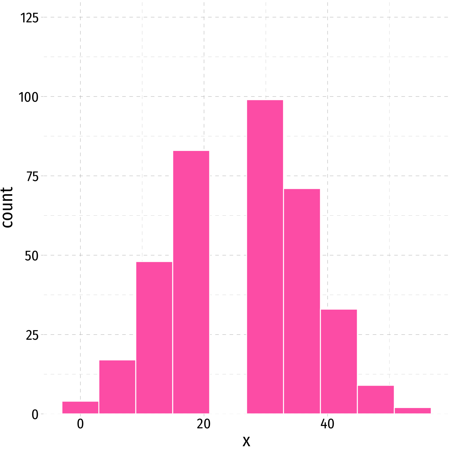
Histograms
A common way to present a quantitative variable's distribution is a histogram
- The quantitative analog to the bar graph for a categorical variable
Divide up values into bins of a certain size, and count the number of values falling within each bin, representing them visually as bars
Histogram: Example
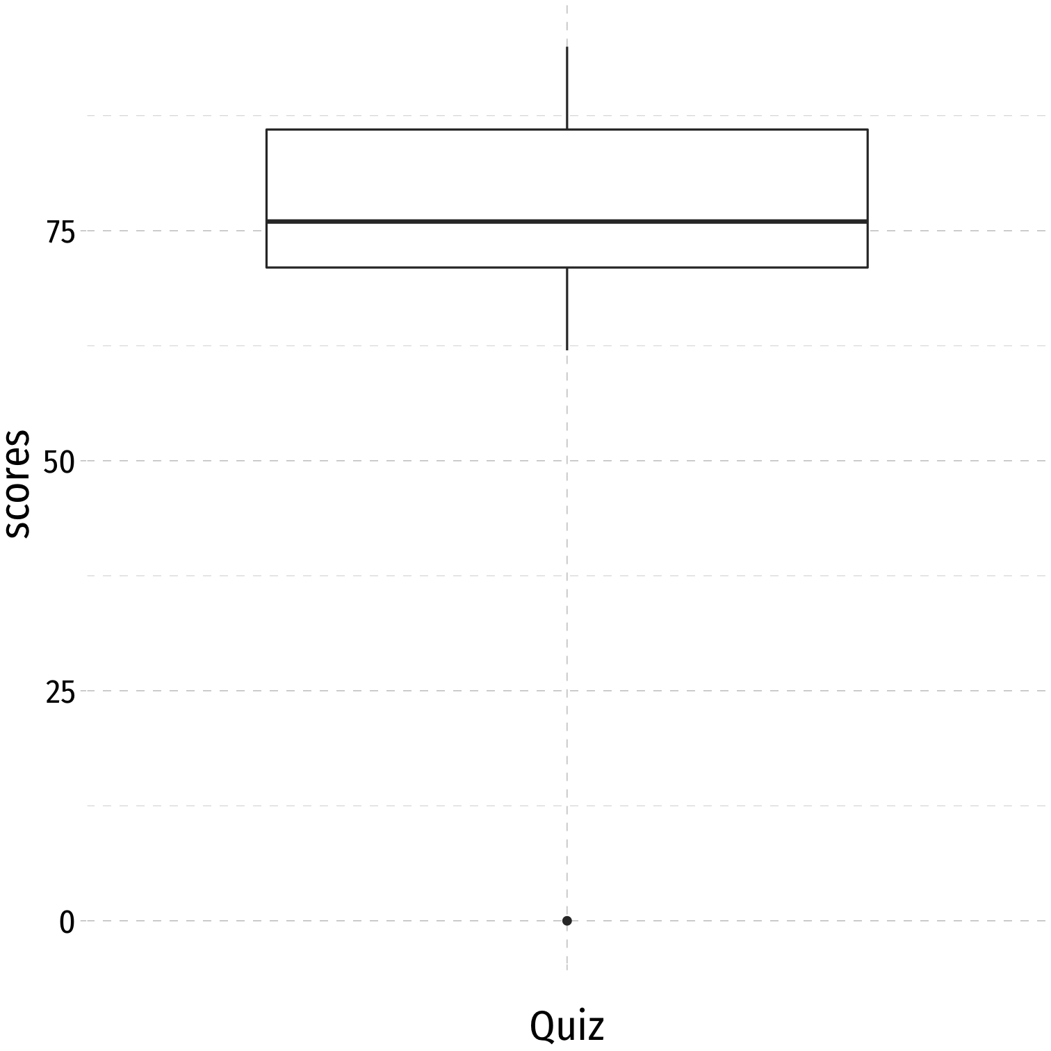
Example: a class of 13 students takes a quiz (out of 100 points) with the following results:
{0,62,66,71,71,74,76,79,83,86,88,93,95}
h<-ggplot(quizzes,aes(x=scores))+ geom_histogram(breaks = seq(0,100,10), color = "white", fill = "#56B4E9")+ scale_x_continuous(breaks = seq(0,100,10))+ scale_y_continuous(limits = c(0,6), expand = c(0,0))+ labs(x = "Scores", y = "Number of Students")+ ggthemes::theme_pander(base_family = "Fira Sans Condensed", base_size=20)h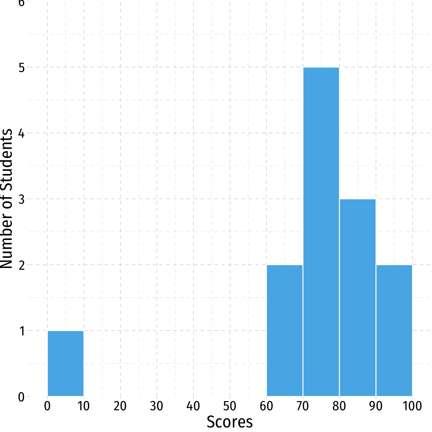
Descriptive Statistics
- We are often interested in the shape or pattern of a distribution, particularly:
- Measures of center
- Measures of dispersion
- Shape of distribution
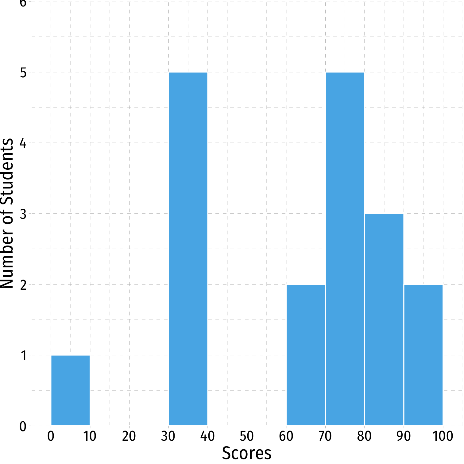
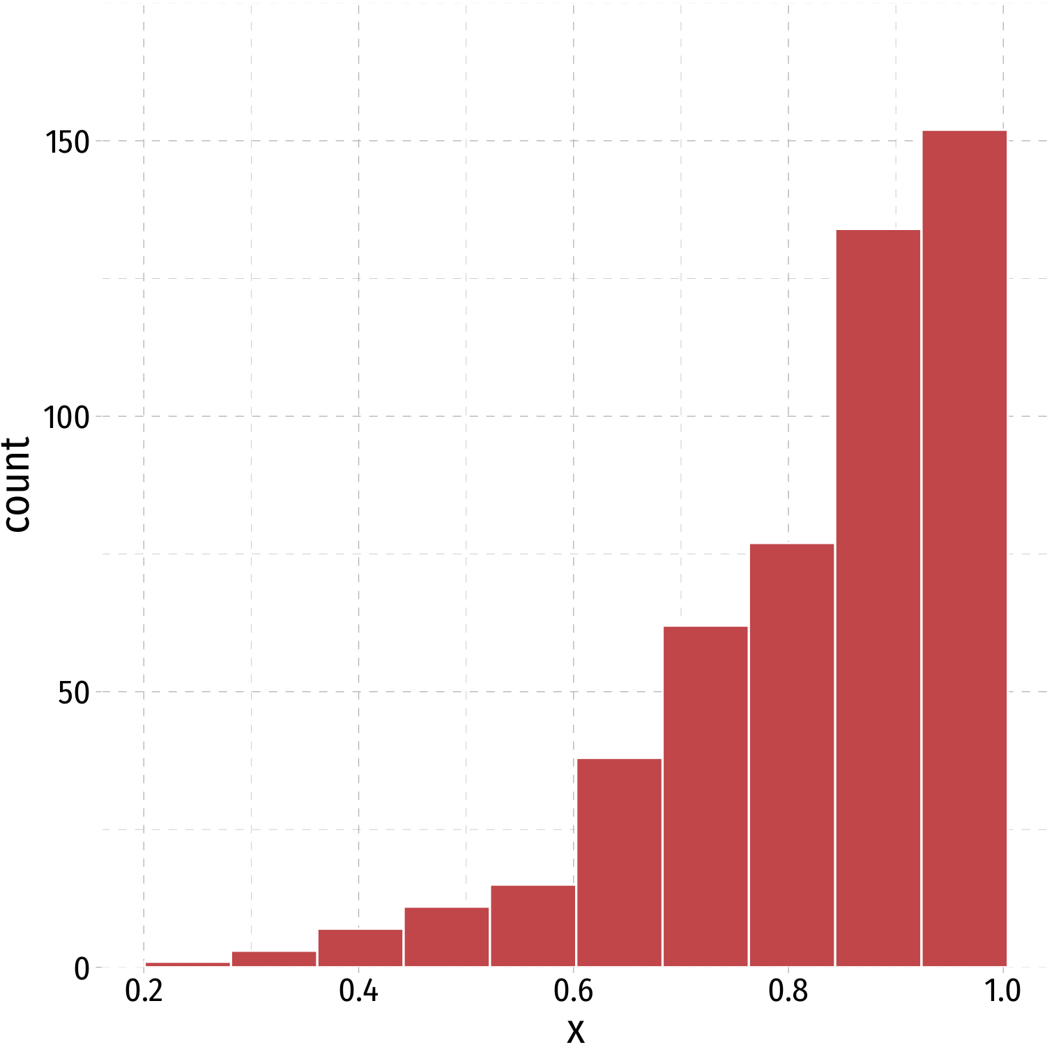
Multi-Modal Distributions
Looking at a histogram, the modes are the "peaks" of the distribution
- Note: depends on how wide you make the bins!
May be unimodal, bimodal, trimodal, etc
Symmetry and Skew I
A distribution is symmetric if it looks roughly the same on either side of the "center"
The thinner ends (far left and far right) are called the tails of a distribution
Symmetry and Skew I
- If one tail stretches farther than the other, distribution is skewed in the direction of the longer tail
Outliers
Outlier: extreme value that does not appear part of the general pattern of a distribution
Can strongly affect descriptive statistics
Might be the most informative part of the data
Could be the result of errors
Should always be explored and discussed!

Mean, Median, and Outliers

Mean, Median, Symmetry, Skew I
- Symmetric distribution: mean ≈ median
symmetric %>% summarize(mean = mean(x), median = median(x))## # A tibble: 1 x 2## mean median## <dbl> <dbl>## 1 4 4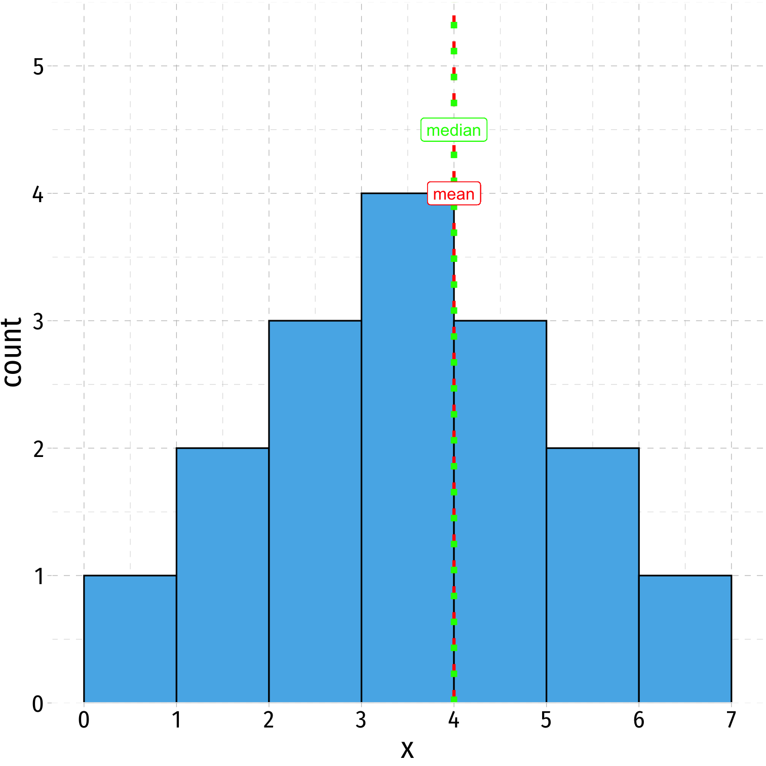
Mean, Median, Symmetry, Skew II
- Left-skewed: mean < median
leftskew %>% summarize(mean = mean(x), median = median(x))## mean median## 1 4.615385 5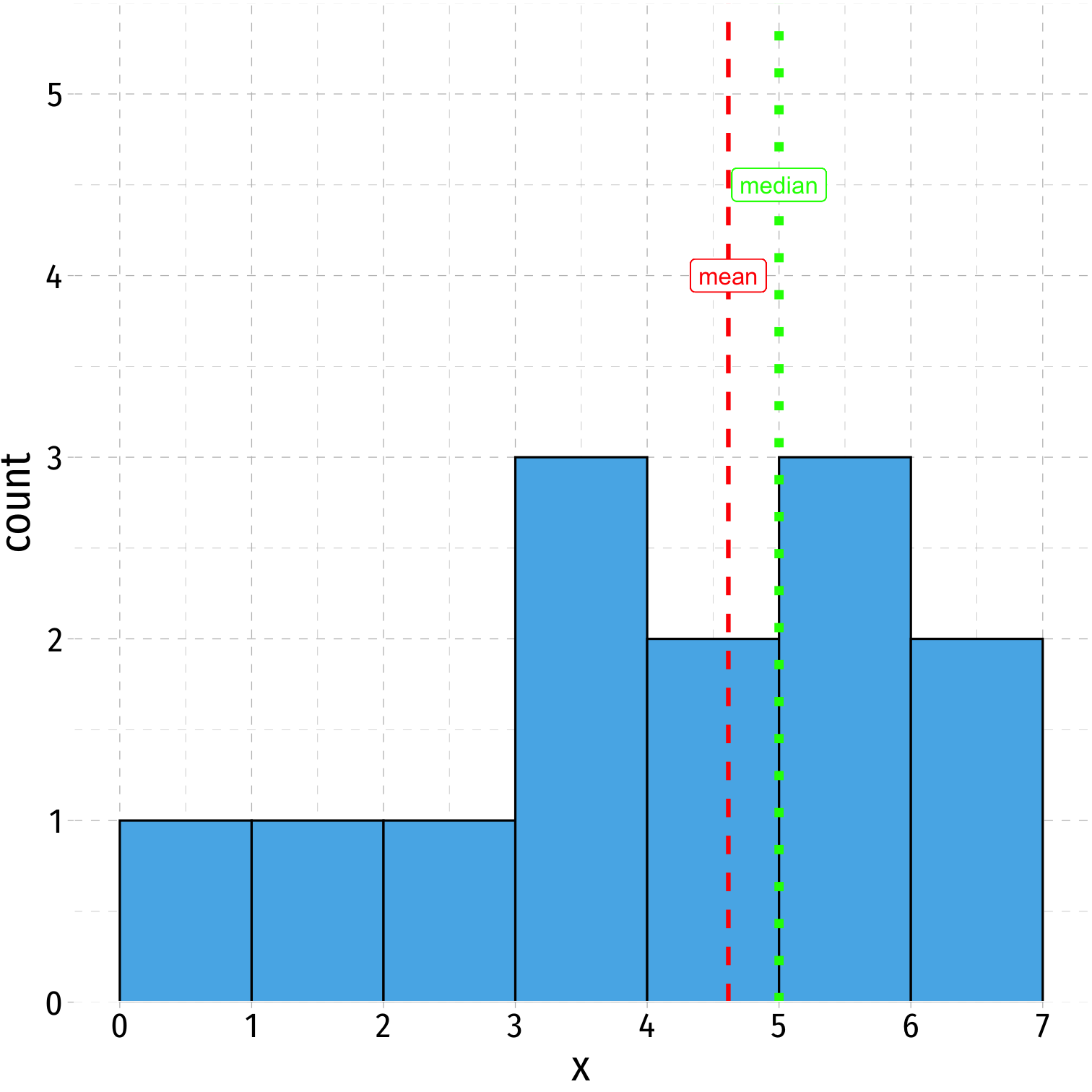
Mean, Median, Symmetry, Skew III
- Right-skewed: mean > median
rightskew %>% summarize(mean = mean(x), median = median(x))## # A tibble: 1 x 2## mean median## <dbl> <dbl>## 1 3.38 3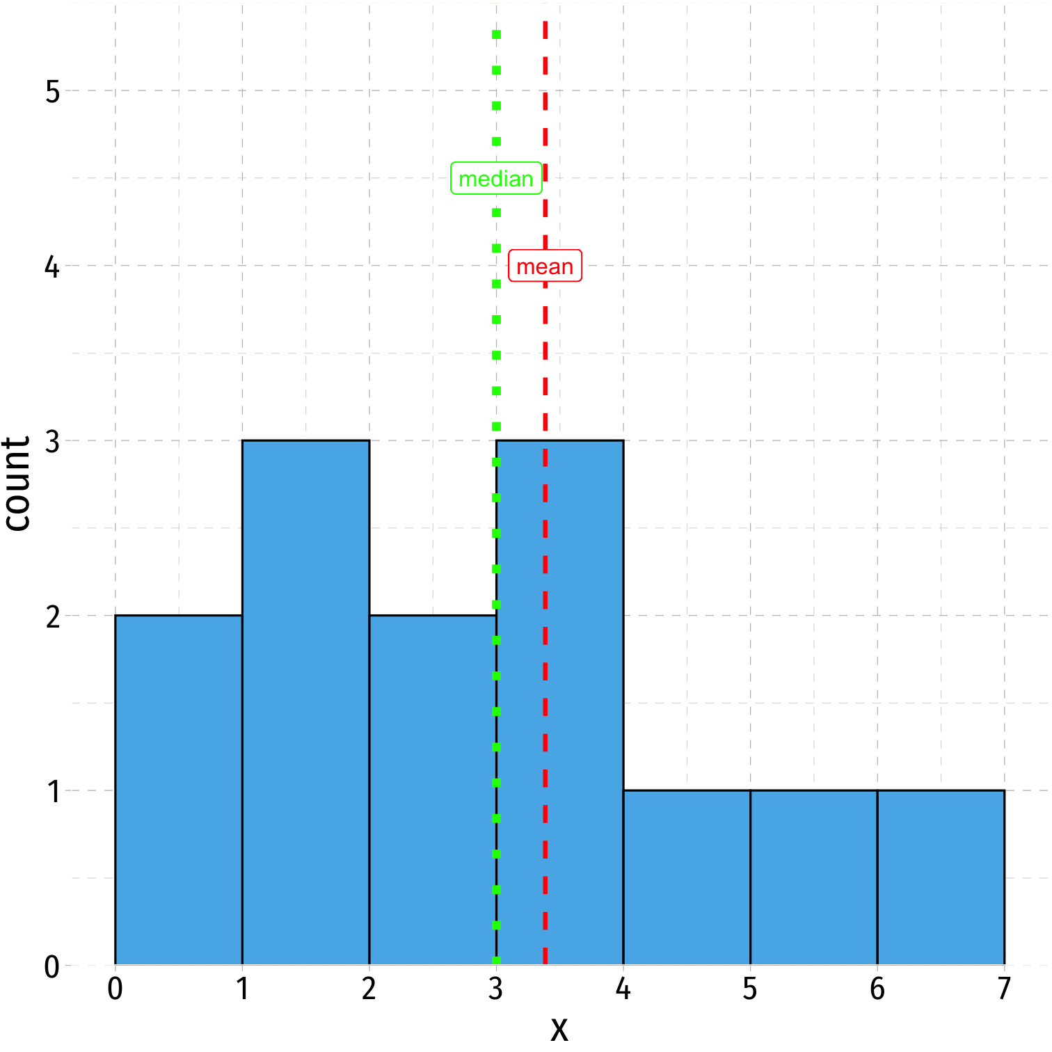
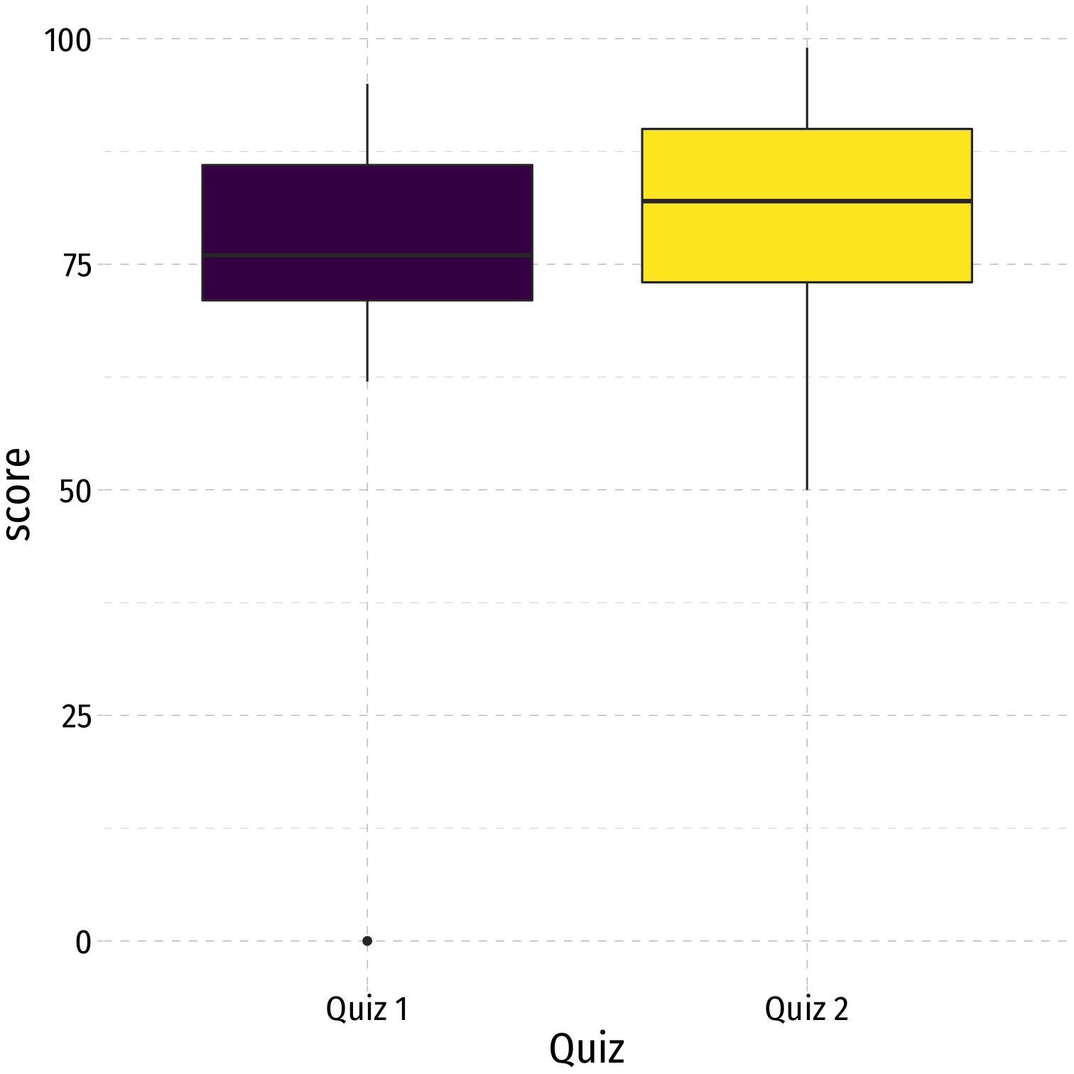
Boxplots I
Boxplots are a great way to visualize the 5 number summary
Height of box: Q1 to Q3 (known as interquartile range (IQR), middle 50% of data)
Line inside box: median (50th percentile)
"Whiskers" identify data within 1.5×IQR
Points beyond whiskers are outliers
- common definition: Outlier>1.5×IQR
Comparisons II
quizzes_new %>% summary()## student quiz_1 quiz_2 ## Min. : 1 Min. : 0.00 Min. :50.00 ## 1st Qu.: 4 1st Qu.:71.00 1st Qu.:73.00 ## Median : 7 Median :76.00 Median :82.00 ## Mean : 7 Mean :72.62 Mean :80.62 ## 3rd Qu.:10 3rd Qu.:86.00 3rd Qu.:90.00 ## Max. :13 Max. :95.00 Max. :99.00